SaaS Cohort Analysis: What It Is, Types, Metrics, and How to Run One
 Sabari Rohith
Last updated on
Sabari Rohith
Last updated on

SaaS cohort analysis groups customers by a shared starting point, usually the month they signed up, then tracks how each group’s retention and revenue change over time. It replaces one blended average with a set of comparable groups, so you can see whether newer customers are actually sticking better than older ones.
TL;DR
- SaaS cohort analysis splits customers into groups by signup date or acquisition channel and tracks each group’s retention separately instead of relying on one company-wide average.
- Blended metrics hide the exact problem cohorts expose: a healthy top-line MRR number that’s really just new sales covering for an older group quietly churning out.
- There are three cohort types worth building: acquisition cohorts (by signup month), behavioral cohorts (by an action taken), and channel cohorts (by where the customer came from).
- The metrics that belong in a cohort table are retention rate, churn rate, net revenue retention, cohort-level LTV, and CAC payback period, rather than vanity totals like total signups.
- Running one takes five steps: pick the cohort unit, pick the time window, pick the metric, build the retention table, then read it across and down before acting on it.
What Is SaaS Cohort Analysis?
SaaS cohort analysis is the practice of grouping customers by a shared trait, most often their signup month, and tracking that group’s retention or revenue separately from every other group. Instead of one number for “how’s retention doing,” you get a comparison across groups.
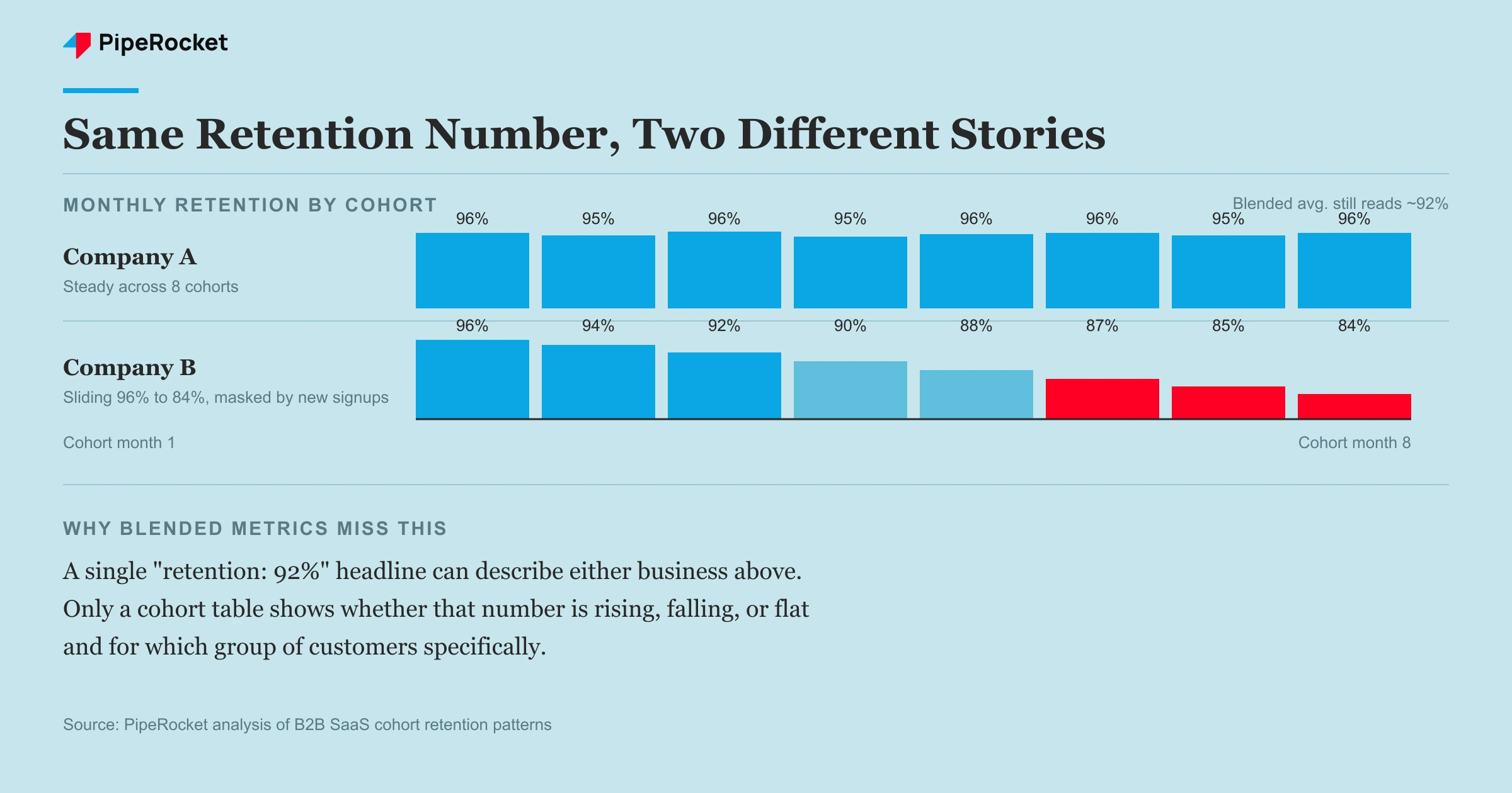
Picture two companies with identical 92% monthly retention on their dashboard. Company A’s number has held steady for eight straight cohorts. Company B’s number is an average masking a slide from 96% to 84% over the same period, with new signups arriving fast enough to keep the blended figure from moving.
| Company A | Company B | |
|---|---|---|
| Dashboard retention | 92% | 92% |
| 8-cohort trend | Flat, 96% to 96% | Sliding, 96% to 84% |
| What’s really happening | Stable base | Older cohorts quietly churning, backfilled by new signups |
Same headline metric. Completely different businesses. A blended average can’t tell you which one you’re looking at. A cohort table can, because it never lets a new group’s honeymoon period cover for an old group’s decline.
This matters more in SaaS than almost anywhere else because the subscription model means revenue is a bet on retention, not a one-time transaction. A single “customers retained: 88%” statistic sitting in a board deck tells you nothing about direction. A cohort table tells you whether that 88% is rising, falling, or flat, and for which group of customers specifically.
Why SaaS Cohort Analysis Matters More Than Blended Metrics
Cohort analysis matters because it’s the only view that separates a genuinely healthy growth engine from one that’s being propped up by new sales volume. Two problems live inside blended metrics that cohorts fix directly.
Total MRR Can Hide Real Churn
A growing top-line MRR number tells you revenue is coming in. It tells you nothing about whether it’s leaving just as fast on the other side. If new signups keep arriving at a steady clip, they can mask an older cohort’s decay for quarters before anyone notices.
We’ve seen this exact pattern on client accounts: total revenue climbing month over month while the retention curve for cohorts acquired six or more months back was already sliding. The dashboard said “growth.” The cohort table said “we have a leaky bucket and we’re just filling it faster than it drains.”
It Tells You If a Change Actually Worked
Cohort analysis is the cleanest way to know whether a product change, a pricing shift, or a new onboarding flow actually improved things, because you can compare the cohort that experienced the change against every cohort that came before it. A blended metric just shows a wiggle in a line chart with no clear cause.
Say you rebuilt onboarding in March. If the March cohort’s month-2 retention beats every cohort from the previous six months, you have a real signal. If it just tracks with the existing trend, the onboarding change probably didn’t move anything, and you saved yourself from crediting a fix that never worked.
The Three Types of SaaS Cohort Analysis
Most SaaS teams only ever build one cohort view: signup month. That’s a start, but it only answers “when did they arrive,” not “why did they stay or leave.” Three cohort types cover the questions that actually matter.
Acquisition Cohorts Group Customers by When They Signed Up
Acquisition cohorts are the baseline: every customer who signed up in a given month or week gets bucketed together, then you track that group’s retention forward. This is what most cohort tables default to, and it’s the right starting point because it’s simple to build from billing data alone.
The limit is that acquisition cohorts only tell you retention is changing, not why. A dip in the June cohort could be pricing, could be a bad batch of leads, could be a broken feature that shipped that month. You need at least one more cohort type layered on top to get an answer.
Behavioral Cohorts Group Customers by an Action They Took
Behavioral cohorts split customers by something they did or didn’t do early on, like completing setup within 48 hours, inviting a teammate, or hitting a specific feature in week one. This is where cohort analysis starts producing decisions instead of just observations, because it points at a lever you can actually pull.
If customers who invite a teammate in their first week retain at a meaningfully higher rate than those who don’t, you’ve found a real growth lever: get more people to invite a teammate in week one. That’s an activation target a product or onboarding team can build against, not just a retention number to report on.
Channel Cohorts Group Customers by Where They Came From
Channel cohorts split customers by acquisition source, organic search, paid ads, referral, outbound, and compare how each group retains and converts. This is the one most SaaS teams skip, and it’s the one with the clearest budget consequences attached.
The same segmentation logic runs on other dimensions too. You can group cohorts by plan type (starter versus enterprise) or by company size (SMB versus mid-market), since a self-serve starter cohort and a sales-led enterprise cohort almost never retain on the same curve. Channel is the split with the loudest budget signal, but plan and company size often explain why two same-month cohorts diverge.
Not all signups are equal even at the same price point. A customer who found you through a comparison page they searched for tends to arrive with a clearer idea of what they’re buying than one who clicked a display ad.
Our own data across the B2B SaaS accounts we manage backs this up in aggregate: organic-driven visitors convert to leads at roughly 3.5x the rate of AI-referral traffic (0.92% versus 0.26%), and that quality gap tends to carry through into how those customers behave after signup, not just whether they convert.
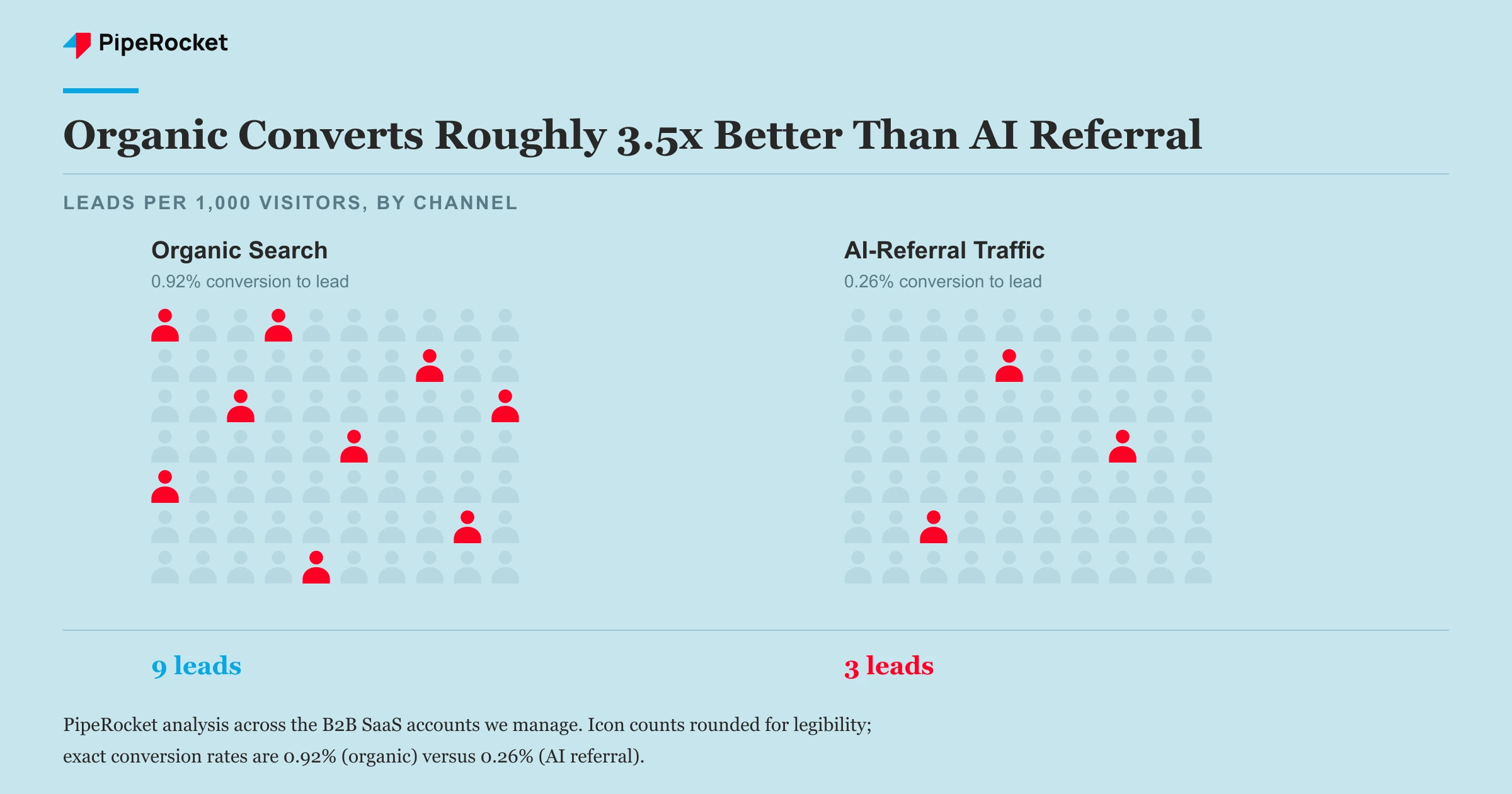
If your paid channel is generating cohorts that churn twice as fast as your organic cohort, you have a targeting problem showing up downstream, and no amount of onboarding polish fixes it.
The Metrics That Actually Belong in a Cohort Table
Five SaaS metrics belong in a cohort table: retention rate, churn rate, net revenue retention, cohort-level LTV, and CAC payback period . Each shows direction over time, which is the thing a volume total can never tell you. A cohort table only earns its place on a dashboard when it tracks these instead of raw signup counts.
| Metric | What it shows | Why it beats a blended number |
|---|---|---|
| Retention rate | % of a cohort still active at month N | Isolates decay by cohort instead of averaging it away |
| Churn rate | % of a cohort lost between month N and N+1 | Shows the exact month a cohort starts leaking |
| Net revenue retention (NRR) | Revenue from a cohort now vs. at signup, including expansion | Reveals whether survivors are growing or just holding steady |
| Cohort-level LTV | Total revenue a cohort generates before it fully churns out | Lets you compare acquisition cost against real payback, rather than an assumed one |
| CAC payback period | How many months a cohort’s cumulative revenue takes to cover the cost of acquiring it | Ties retention directly to acquisition spend, so a slow-paying channel shows up early |
Retention rate and churn rate are two sides of the same coin, and most teams only track one. Track both, because a flat retention rate can still hide an accelerating churn rate if new activity is backfilling the cohort in ways that mask the trend.
NRR is the metric that separates a stable base from a growing one. A cohort holding 90% retention but only 70% NRR means the customers who stayed are shrinking their spend, which is its own warning sign even if the headcount number looks fine.
NRR is often confused with Gross Dollar Retention (GDR), and the difference matters when you read a cohort. GDR measures how much starting revenue a cohort keeps after churn and downgrades only; it excludes expansion, so it caps at 100%. NRR adds expansion revenue back in, so it can climb above 100% when survivors upgrade. A cohort at 95% GDR but 115% NRR is losing some accounts while the rest grow enough to more than cover the loss.
CAC payback period is the metric that connects retention back to what you spent to acquire the cohort. If your paid cohort takes 15 months of cumulative revenue to recover its acquisition cost while your organic cohort recovers in 6, that gap is a budgeting decision hiding inside the retention curve. It is one of the core SaaS metrics that ties channel choice to unit economics.
Cohort-level LTV is where the acquisition-channel math gets real. If your paid channel cohorts have a 14-month average lifespan and your organic cohorts run 22 months at a similar deal size, that’s a straight multiplier on how much you can justify spending to acquire through each channel. A single blended LTV number erases that entire comparison.
How to Run a SaaS Cohort Analysis, Step by Step
Running a SaaS cohort analysis takes five steps: pick the cohort unit, pick the observation window, pick the metric, build the table, then read it for the pattern, not just the numbers.
- Pick the cohort unit first. Decide what defines a cohort before touching any data. Signup month is the default and the right first choice for most teams, since it’s easy to pull from billing records and gives you a clean baseline before adding behavioral or channel splits.
- Pick the observation window. Choose how far forward you’ll track each cohort, and make it long enough to see the real churn curve, not just the initial trial-conversion bump. For most B2B SaaS products, 12 months is the minimum window that reveals whether retention is actually stabilizing or still sliding.
- Pick the metric you’re tracking. Decide upfront whether the table tracks retention rate, revenue, or both. Trying to read too many metrics off one table at once is how cohort analysis turns into a spreadsheet nobody opens twice. Start with retention rate alone, then layer in NRR once the base table is a habit.
- Build the retention table. Lay cohorts down the rows (by signup month) and time periods across the columns (month 0, month 1, month 2…), with each cell showing the percentage of that cohort still active. Most billing platforms and product analytics tools (Stripe, Amplitude, and similar) can generate this table directly from event or subscription data, so you rarely need to build it by hand in a spreadsheet once volume grows.
- Read it across and down, not just at the total. Read a cohort table two ways: across a single row to see how one cohort decays over time, and down a single column to compare the same month-N retention across different signup cohorts. The second read is the one most teams skip, and it’s the one that tells you whether things are getting better or worse.
If month-3 retention keeps climbing cohort over cohort, whatever you changed recently is working. If it’s dropping, something is quietly getting worse and the blended number just hasn’t caught up to showing it yet.
A Worked Cohort Example
Here is what reading a table down a column looks like in practice. The numbers below are illustrative, but the math is internally consistent: each cohort starts at 100% in month 0, and each cell is the share of that signup group still active N months later.
| Signup cohort | Month 0 | Month 1 | Month 2 | Month 3 |
|---|---|---|---|---|
| January | 100% | 88% | 82% | 78% |
| February | 100% | 90% | 85% | 82% |
| March | 100% | 93% | 89% | 86% |
Read across the January row and you see a normal decay curve: 100% down to 78% by month 3. Read down the month-3 column instead, the more useful read, and the story changes: retention climbs from 78% (January) to 82% (February) to 86% (March). If you rebuilt onboarding in February, that steady climb in the same-month column is the signal that the change worked, and it is invisible in a blended average that would just report roughly 82% either way.
Common Mistakes to Avoid
Building the Table and Never Reading It Down
Plenty of teams build a beautiful cohort table, then only ever glance at the newest row and the bottom-line average. The real signal sits in comparing the same time-period column across cohorts. Skip that comparison and you’ve built a report, not an analysis.
Tracking Too Short a Window
A three-month observation window looks clean because retention is still high for almost everyone at that point. Most of the real churn in B2B SaaS shows up between months four and twelve, so a short window will tell you everything is fine right up until it isn’t.
Treating All Cohorts as One Acquisition Motion
Mixing organic, paid, and referral signups into a single acquisition-month cohort erases exactly the comparison that makes channel cohorts useful. If you can’t tell which channel a decaying cohort came from, you can’t tell whether the fix is a product problem or a targeting problem.
Chasing Statistical Significance on Tiny Cohorts
A cohort of eight customers from a slow month will swing wildly, one cancellation can move the retention rate by more than 10 points. Reading too much into a small cohort’s dip is a common way teams chase noise instead of signal. Wait for cohort sizes to reach a reasonable scale, or group adjacent slow months together, before treating a swing as real.
How PipeRocket Digital Helps With This
We build the content and channel strategy that feeds your cohort tables, not just the traffic. When we run SaaS SEO programs, we deliberately target the buyer-intent keywords that tend to produce the higher-retaining cohorts rather than the ones with the biggest search volume.
If you want a channel mix built around which cohorts actually stick, see how we approach it on our SaaS marketing agencies page, or get in touch directly.
Frequently Asked Questions
What is SaaS cohort analysis?
SaaS cohort analysis groups customers by a shared starting point, usually their signup month, and tracks that group’s retention or revenue separately over time instead of relying on one blended average. It shows whether a specific group is retaining better or worse than the groups before it.
How do you perform a cohort analysis?
Pick a cohort unit (usually signup month), then track its retention or revenue across a consistent window, typically 12 months for B2B SaaS. Lay cohorts in rows and time periods in columns, then read the table two ways: across a row for one cohort’s decay, and down a column to compare cohorts.
What’s the difference between a cohort and a segment?
A cohort is a fixed group defined by a shared starting point in time, like signup month, that you track forward without changing its members. A segment is a filter you apply at any moment, like Pro-plan customers, and its membership changes day to day. Cohorts show change over time; segments show who fits a description now.
What is a cohort analysis example?
Two companies both show 92% retention on their dashboard. One cohort held flat at 96% for eight months; the other slid from 96% to 84%, hidden by new signups backfilling the average. The cohort table exposes the difference a blended number cannot.