A SaaS alternatives page ranks and converts a reader who already left a tool behind. It works by naming the switcher’s specific frustration, listing real options honestly, and putting your product’s fit front and center instead of just listing features.
TL;DR
- Most alternatives pages get written like comparison pages, and that mismatch is why they rank but don’t convert.
- The switcher arrives already frustrated, so the page has to name that frustration before it names any product.
- A rigged-looking list of five options where four are strawmen kills trust in the first ten seconds.
- The page needs a scannable structure the switcher can get through in under a minute.
- Honest positioning, including where you’re not the best fit, converts better than blanket promotion.
- CTA placement should track where the reader’s decision actually forms on the page.
Why Most Alternatives Pages Get the Reader Wrong
The reader on a “[Tool] Alternatives” page already used that tool and hit a wall. Maybe the pricing jumped at renewal, maybe support went quiet, maybe a feature they needed never shipped. They’re not weighing two logos side by side. They’re looking for an exit.
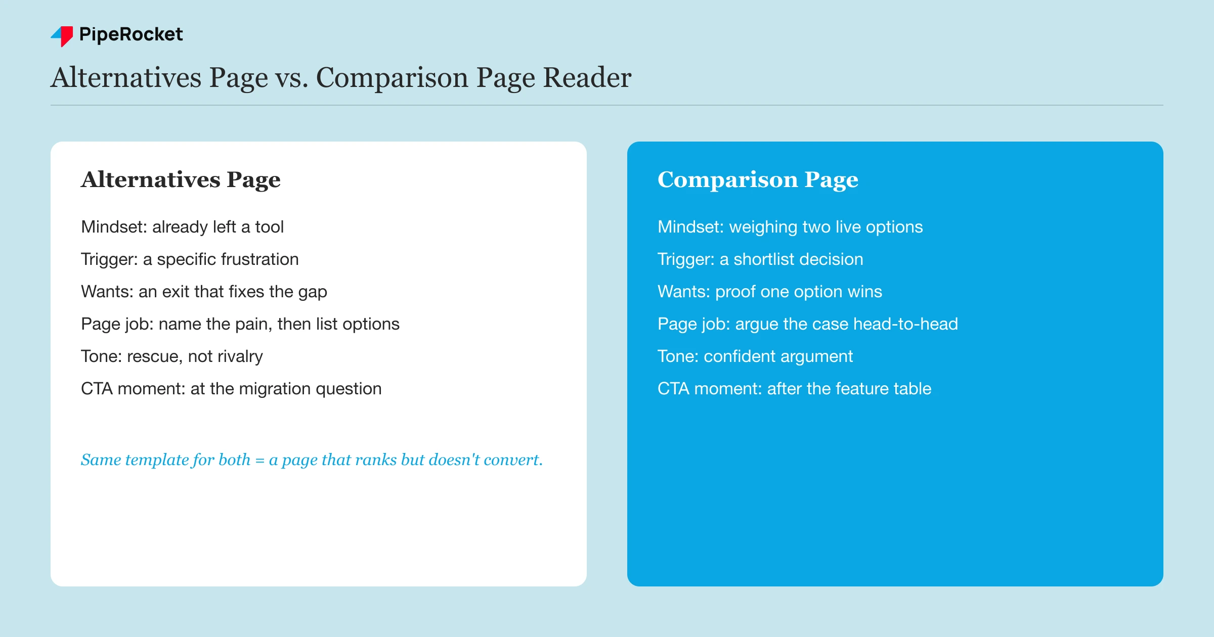
That’s a completely different reader than the one on a comparison page, and it means the page needs a different job. A comparison page argues “we’re better than X because of Y.” An alternatives page says “here’s what actually solves the problem X left you with.” I’ve watched teams write both pages with the same template and wonder why the alternatives version ranks fine but the demo requests never show up.
Here’s the tell: if your alternatives page opens with a feature grid before it acknowledges why someone would be reading it, you wrote a comparison page with a different H1. The switcher doesn’t care yet what your onboarding flow looks like. They want to know if the specific thing that broke their last tool is fixed here, and they want the answer before they scroll past the fold.
This isn’t a “how alternatives pages differ from comparison pages” primer. That ground is already covered in our comparison page guide. This post is the craft of writing the alternatives page itself, and one more thing before the steps: this is about writing the page content, not about running PipeRocket’s internal production tooling. If you’re on our team and looking for the alternatives-writer skill, that’s a separate internal workflow.
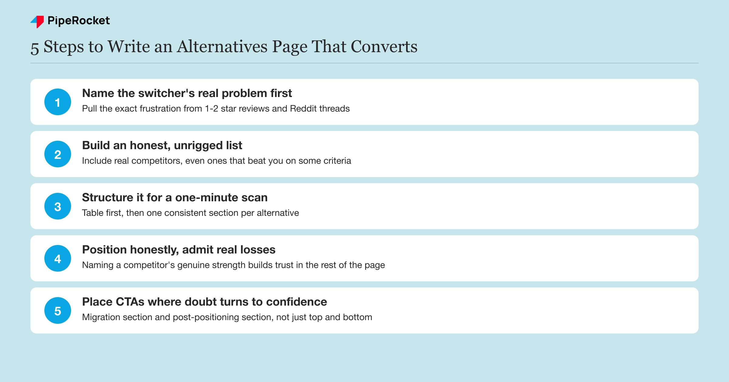
Step 1: Name the Switcher’s Real Problem Before You Name Any Product
Open by stating the specific failure mode that sends people looking for alternatives. Skip the generic “looking for options?” line. If the tool everyone’s leaving has a pricing cliff at 50 seats, say that. If support quality tanks after the free trial ends, say that too.
I’ll be honest, this is the section most teams skip because it feels like it should be short. It shouldn’t be. A reader who sees their exact frustration named back to them in the first two sentences trusts the rest of the page more, because you’ve proven you understand the problem before you’ve sold anything.
Pull the Frustration From Real Sources, Not Guesswork
Check G2 and Capterra reviews for the incumbent tool, filtered to 1 and 2-star ratings, and read what people actually complain about. Check Reddit threads where people ask “anyone moved off [Tool]?” These give you the real language switchers use, which is different from the language your own sales team uses to describe the gap.
Separate the One Big Reason From the Minor Gripes
Most switch decisions come down to one dominant reason, price, a missing integration, or reliability, with two or three smaller gripes layered on top. Lead with the dominant reason in your opening paragraph and save the smaller ones for later sections. Burying the real reason under five minor complaints dilutes the page’s whole argument.
Step 2: Build the List So It Doesn’t Look Rigged
Include real alternatives, even ones that beat you on some criteria, or the whole list reads as a sales pitch wearing a listicle costume. A five-tool roundup where four are obvious strawmen gets spotted within seconds by the exact audience that’s evaluating you most carefully.
Pick three to five genuine alternatives based on actual market presence rather than how favorably they compare to you. If a competitor genuinely wins for a specific use case, like a lighter tool that’s cheaper for very small teams, say so plainly. That admission is what makes the rest of the page credible.
For each alternative, cover the same fields so the reader can scan across rows instead of re-reading paragraph structure every time:
- Starting price and what it actually includes
- The one thing that tool is genuinely best at
- The gap that sends people looking elsewhere
- Who it’s the right fit for
Where you land in that list matters too. Don’t force yourself into the number one slot by manipulating criteria. Rank based on the same honest fields you used for everyone else, and if you land second or third for a specific use case, that’s a more credible page than one where you mysteriously top every category.
Step 3: Structure the Page So the Switcher Can Self-Qualify Fast
A switcher scans, they don’t read line by line, at least not on the first pass. The page needs to work at the skim level: headings, a table, and bolded fit criteria should carry the argument on their own.
Open with a short, direct summary of the landscape in two or three sentences, then drop straight into a comparison table with pricing, best-fit use case, and the main gap for each tool. Follow the table with one section per alternative, each covering the same structure so the reader isn’t reorienting every time they hit a new heading.
Close each tool’s section with a plain “best for” line rather than making the reader infer it from a paragraph of feature description. “Best for small teams under 10 seats who don’t need SSO” tells a reader in one line whether to keep reading about that tool or skip to the next one.
Give the Switcher a Migration Answer, Not Just a Feature List
The single biggest hesitation for anyone reading an alternatives page is the fear of re-doing setup work they already suffered through once. If you offer data migration, white-glove onboarding, or an import tool, put that detail right next to your pricing instead of leaving it buried three clicks away.
Step 4: Write Positioning That Wins Without Trashing the Incumbent
State plainly where your product wins and where it doesn’t, because a page that claims to win on every single criterion reads as marketing copy, and switchers have already been burned by marketing copy once. That’s exactly why they’re reading this page.
Naming a competitor’s real strength costs you almost nothing and buys you a lot of trust. If the tool people are leaving genuinely has a better free tier, say it, and then explain why your paid tier still wins for teams past a certain size. Readers forgive a fair loss on one criterion far more than they forgive a page that never admits to losing on anything.
Avoid changing a competitor’s public pricing to make your own numbers look better, and avoid discounting your own price for the sake of a flattering table. Switchers check the incumbent’s actual pricing page constantly during this research phase, and one caught discrepancy erases the credibility you spent the whole page building.
Step 5: Place CTAs Where the Switcher’s Decision Actually Forms
A switcher’s decision doesn’t form at the top of the page, so a single CTA sitting only in the hero and the footer misses where the actual moment of conviction happens. Map CTAs to the specific point where doubt turns into confidence for that reader.
Put a light CTA near the migration or import section, since that’s where hesitation about switching costs peaks and a “see how migration works” link directly answers it. Put a second CTA after the honest positioning section, where you’ve just admitted a limitation and then explained your fit, because that’s the moment trust is highest.
Keep the CTA copy specific to what the switcher is worried about right there on the page. “Talk to migration support” next to the import section converts better than a generic “Book a Demo” repeated five times down the page, because it answers the exact objection sitting in the reader’s head at that scroll position.
Common Mistakes to Avoid
Writing It Like a Comparison Page
Using the same template for both page types is the single most common failure, because the switcher’s mindset (frustrated, exiting) is nothing like the evaluator’s mindset (curious, weighing). Copy the comparison page’s table format if it helps scanning, but never copy its “we’re better because” argument structure onto a page whose reader hasn’t chosen a fight yet.
Padding the List With Strawman Competitors
Adding tools nobody actually considers just to make your product look stronger by contrast gets noticed immediately by an audience that’s actively researching the category. It tanks trust in the entire page, including the parts that were accurate.
Hiding or Distorting Competitor Pricing
Quoting a stale price, omitting a cheaper tier, or rounding a competitor’s number up erodes the one thing this page type depends on more than any other, which is the reader’s belief that you’re playing it straight. Switchers check.
Skipping the Migration Question Entirely
Leaving out any mention of how someone actually moves off their current tool leaves the reader’s biggest unspoken fear unanswered, and an unanswered fear is what sends them back to the search results to keep looking.
How PipeRocket Digital Helps With Alternatives Pages
We build alternatives pages as part of the decision-stage cluster inside a full SaaS SEO program, backed by real competitor research instead of guesswork. If you want pages that convert switchers instead of just ranking for a keyword, our team can build the honest, structured version and wire it into the rest of your funnel. You can see how we approach this kind of work across SaaS marketing agencies generally, or just talk to us directly .
Frequently Asked Questions
What is a SaaS alternatives page?
A SaaS alternatives page is a landing page that targets searches like “[Competitor] Alternatives” and lists genuine options for someone leaving that tool, including your own product positioned honestly against the others. It’s written for a reader who has already used the incumbent tool and hit a real limitation, unlike a comparison page written for someone still choosing between two options from scratch.
How is an alternatives page different from a comparison page?
An alternatives page speaks to someone exiting a tool that failed them, while a comparison page speaks to someone weighing two options they haven’t chosen between yet. That difference changes the opening, the tone, and which section carries the most weight, since the alternatives reader needs their frustration named before anything else, and the comparison reader needs a fair head-to-head from the first paragraph.
Should I include competitors that beat my product on some features?
Yes, and leaving them out is one of the fastest ways to lose the reader’s trust. Naming a competitor’s genuine strength, even one you don’t match, makes the rest of the page’s claims believable, because you’ve shown you’re not just stacking the deck in your own favor.