How to A/B Test SaaS Landing Pages (Without Fooling Yourself)
 Ranjeeth Kumar
Last updated on
Ranjeeth Kumar
Last updated on
Most SaaS A/B tests never had the traffic to prove anything. The team ships a green-button-vs-blue-button test on a page that gets 400 visitors a month, calls it after ten days because the numbers “look better,” and rolls out a change that was pure noise. Here’s how we run landing-page tests that actually tell you something, and why most of the SaaS ones you’ve read about were probably wrong.
TL;DR
- Most SaaS pages can’t A/B test the small stuff: low traffic and few conversions mean button colors and micro-copy will never reach significance. Test big swings or don’t test.
- Pick one variable and a real hypothesis: change one thing, write down what you expect to happen and why, so a win teaches you something you can reuse.
- Test the fold, the offer, and the friction first: the headline, the CTA/offer, and form length move conversion far more than cosmetic tweaks.
- Size the test before you launch: decide your baseline rate, minimum lift worth caring about, and run length up front, then don’t peek and stop early.
- Read it by conversions: a “winning” CTA click rate that doesn’t produce more demos or trials is a vanity win. Judge the test on pipeline actions like demos and trial starts.
- Avoid the fake-win traps: early peeking, testing during a traffic spike, and rolling out a result that never cleared significance are how teams fool themselves.
Why Most SaaS Landing-Page A/B Tests Are a Waste of Time
The uncomfortable truth: most SaaS landing pages don’t have the traffic to run a valid A/B test on anything small. A classic split test needs a few hundred conversions per variant to reliably detect a modest lift. A SaaS product page pulling a couple thousand visitors a month, converting at 3%, produces maybe 60 conversions. Split that across two variants and you’re reading tea leaves.
So teams do one of two things wrong. They either run the test anyway and call a random 12% swing a “win,” or they test cosmetic changes that could never move the needle even at scale.
On a low-traffic page, A/B testing is the wrong tool for small changes. What we’ve seen work is testing big, opinionated swings such as a completely different headline and offer, so the effect size is large enough to show up before your patience runs out. Skip the button-color tweaks entirely. If you genuinely can’t get significance, you’re better off using qualitative data (heatmaps, session recordings) to make a confident redesign, then measuring before-and-after honestly.
Note: “before-and-after” is only an approximation of a true A/B test, and it’s vulnerable to seasonality and traffic-mix shifts. Treat it as the honest fallback you reach for when you don’t have the volume, and say so when you report it.
Reordering a SaaS homepage off attention data (0.8% to 1.5%)
A SaaS client of ours had a landing page that converted well, so when they rebuilt their site they carried that design over to the new homepage. Before we changed anything, we looked at where attention actually went on the page. Two things stood out. The first fold wasn’t holding people: the element pulling the most attention sat just below the fold, so most visitors never reached it. And a section lower down was earning strong engagement from the few who got there, but scroll depth was low, so hardly anyone did.
Both fixes were about order rather than new copy. We moved the attention-grabbing element up into the first fold, and we pulled that high-engagement section higher on the page. Afterward it kept its strong attention and far more people actually scrolled to it. Conversion rate went from 0.8% to 1.5%. We didn’t have the traffic for a clean split test here, so this was an evidence-led redesign measured before against after, which is the honest way to handle a page that can’t support a true A/B test.
Step 1: Start With a Written Hypothesis
Never launch a test to “see what happens.” Every test starts with a written hypothesis, because a win with no reasoning behind it teaches you nothing you can reuse on the next page.
A usable hypothesis has three parts:
- The change: what you’re altering (the headline, the form, the primary CTA).
- The expected outcome: more demo requests, more trial starts, lower bounce.
- The reasoning: why you believe it, ideally grounded in something you observed.
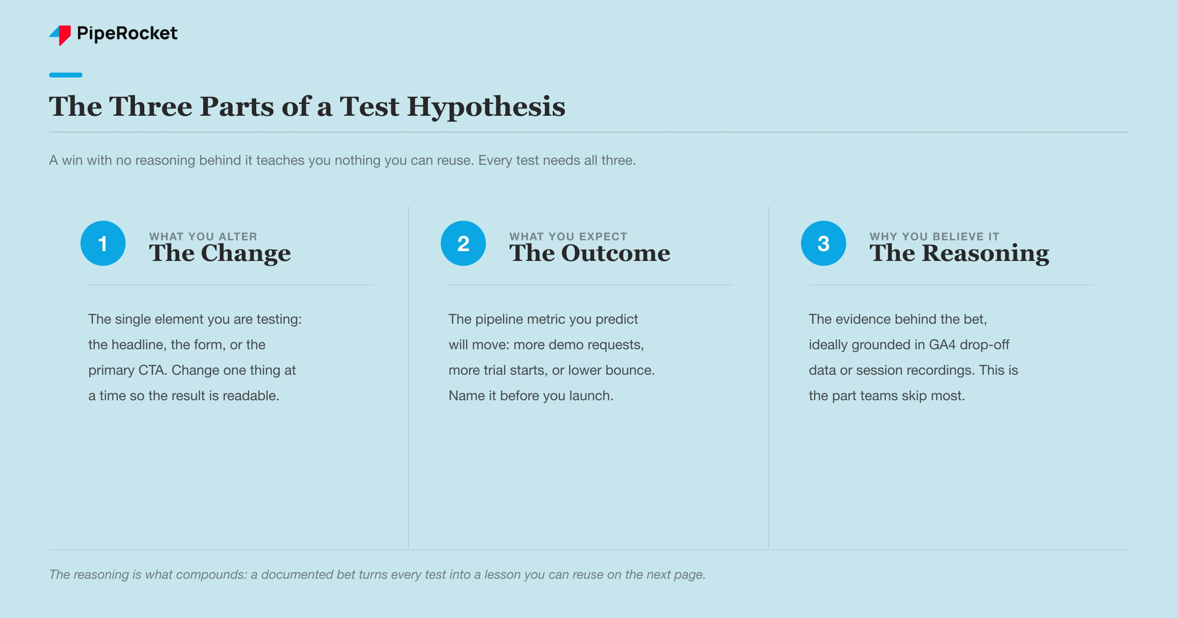
The reasoning is the part teams skip, and it’s the part that compounds. When our team digs into why a SaaS page underperforms, the answer usually comes from data the client already has. A GA4 Path Exploration report shows where people drop off. A session-recording tool like Microsoft Clarity or a heatmap in VWO shows “dead clicks,” where people click mid-paragraph expecting a link that isn’t there, while the real CTA sits far down the page. That’s a hypothesis grounded in evidence, and it’s the kind of test worth running.
Step 2: Test the Three Things That Actually Move Conversion
Test the fold, the offer, and the friction. In that order. These three move SaaS conversion far more than anything cosmetic, and they’re where almost every real win we’ve seen came from.
| What to test | Weak version | Strong version to test against it |
|---|---|---|
| The headline (above the fold) | Describes a feature | Names the buyer’s outcome or fear |
| The offer / CTA | Vague “Get Started,” multiple competing buttons | One specific ask (“Book a 30-minute demo”), repeated |
| Form friction | First name, last name, email, phone, company size | Single primary-email field |
The Fold Is Where You Win or Lose Them
Most drop-off happens in the first scroll, so the headline is the highest-leverage thing you can test. A cybersecurity page we know of ran a feature-led headline (“Pentest at the pace of your code push cycle”) against an outcome-led one (“Know where you’re exposed. Act before hackers do.”). The outcome version speaks to the fear the buyer actually feels. That’s the swing worth testing, because the effect size is big enough to detect and the learning carries to every other page you write.
Kill the Friction in the Form and the CTA
The second and third tests are about removing reasons to leave. Strip a multi-field form down to a single primary-email field and you almost always lift completion, because every extra field is a reason to abandon. On the CTA side, the fix is usually optionality: one page with five competing buttons (“Learn more,” “Contact sales,” “See pricing,” “Watch demo,” “Download”) gives the visitor a decision instead of an action. Test one clear ask, repeated above the fold, mid-page, and at the bottom, against the buffet. We’ve watched that single change lift CTA clicks meaningfully.
Step 3: Size the Test Before You Launch It
Decide the sample size and run length before the test goes live, and write it down. This is the single discipline that separates a real result from a coin flip, and it’s the step SaaS teams skip most.
Three numbers set the test up:
- Your baseline conversion rate: what the current page does today.
- The minimum lift worth caring about: the smallest improvement that would actually change your decision, often a relative 15-20% rather than a fractional 2%.
- The run length: enough time to hit the needed conversions and cover at least one full business cycle (a week minimum, usually two).
Plug the first two into any free A/B test calculator and it tells you how many visitors per variant you need. If that number is 6 months of your current traffic, that’s your answer: don’t run this test. Make the change based on qualitative evidence instead, and measure it honestly.
Run the test for full weeks, and hold to that end condition even after it starts to “look good.” B2B SaaS traffic behaves completely differently on a Tuesday than a Sunday, and buyers on a demo page mid-quarter aren’t the same as end-of-quarter. Cutting a test at ten days because you’re excited slices off a chunk of your own audience and skews the result.
Step 4: Read the Result by Pipeline
Judge the test on the action that produces revenue rather than the click before it. A variant that lifts CTA clicks but leaves demo requests flat only moved people one step further before they bounced, and you’ll have shipped a change that does nothing for pipeline.
This is the SaaS-specific trap. The funnel has more steps than an e-commerce checkout:
- CTA click
- Form view
- Form submit
- Qualified demo / trial start
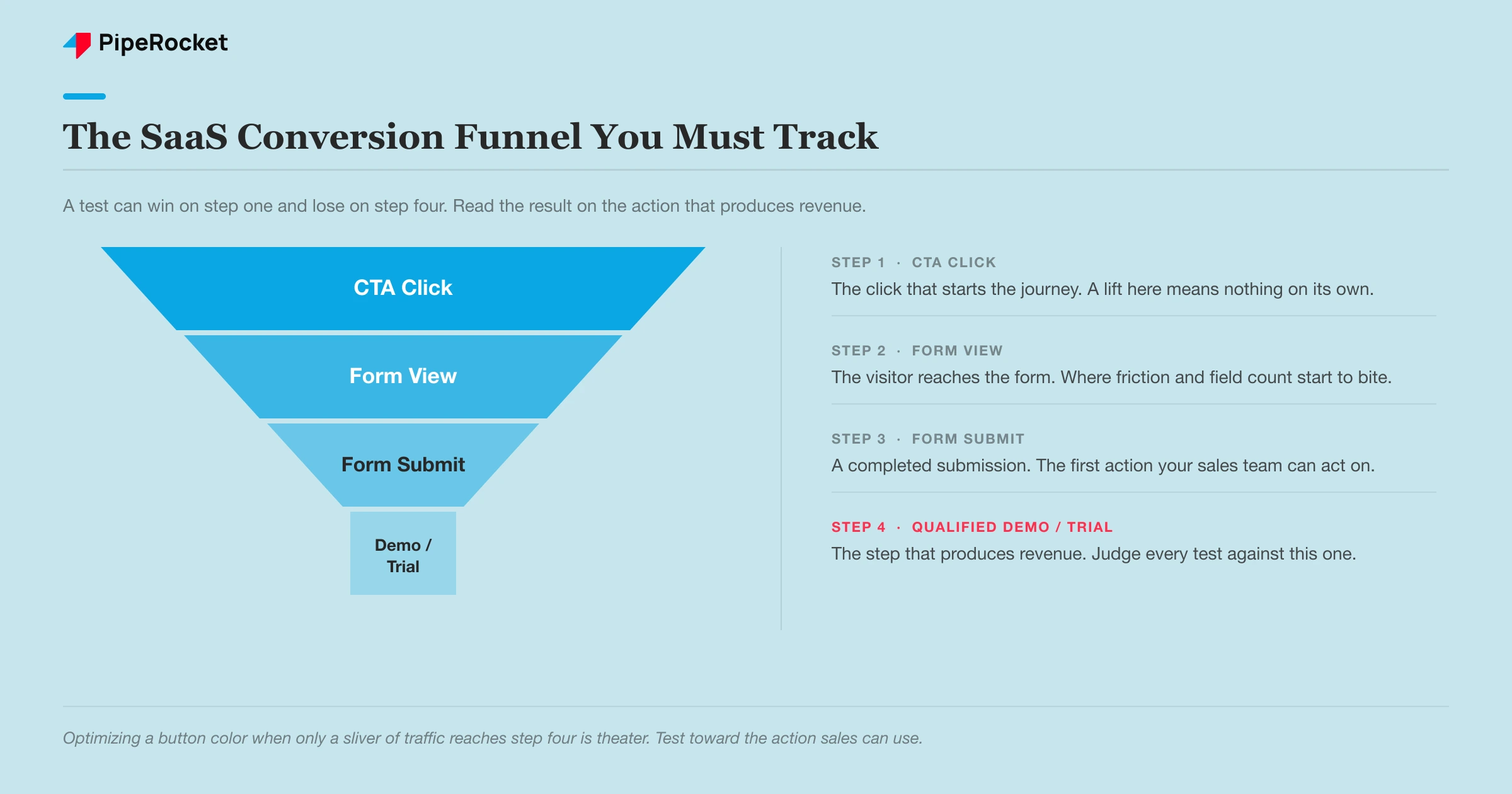
A test can win on step one and lose on step four. We’ve seen pages where the real problem was buried deep, only 4% of traffic was bottom-of-funnel , of that a tiny fraction clicked through, and of those only a sliver filled the form, so thousands of visitors produced a handful of form fills. Optimizing the button color on that page is theater. The measurable actions are what you test toward, and the one that matters is the one your sales team can act on.
One more read to make: check that your “winner” actually cleared statistical significance (95% confidence is the standard), rather than settling for the fact that variant B shows a higher number. A higher number with a wide confidence interval is noise wearing a costume.
Step 5: The Mistakes That Produce Fake Wins
Three habits fake more SaaS A/B test wins than anything else. Each one feels like success in the moment, which is exactly why they slip past busy teams.
Peeking at the dashboard and stopping early
This is the one almost everyone does at least once. You check results on day three, variant B is up 20%, and you call it. The problem is that early in any test the numbers swing wildly because the sample is still tiny, so a lead on day three often evaporates by the time enough visitors have converted. If you stop the moment one variant pulls ahead, you will “find” a winner almost every time, even between two identical pages showing the same content. That is not a win, it is you catching random noise at a flattering moment. The fix is boring but reliable: decide the run length and required sample size before you launch, write it down, and refuse to touch the test until you hit both. Let the math decide when the test is done, and keep the dashboard out of that decision.
Running the test during a traffic anomaly
A test only tells you something useful if the visitors in it look like your normal audience. Launch it the week a big paid campaign, a product launch, or a conference sends a flood of atypical traffic, and you are measuring people who behave nothing like your steady-state buyers. Their intent, their source, and their readiness to convert are all skewed, so the “winner” you crown may only win with that unusual crowd and then fall flat once ordinary traffic returns. It quietly costs SaaS teams because the result looks legitimate on the surface. The fix is to run tests during representative periods, and if an unexpected spike hits mid-test, either note the window so you can segment it out later or extend the run until the anomaly is a small share of the total.
Rolling out a result that never reached significance
This is the most common and most expensive habit. The variant “won,” but it never actually crossed the confidence threshold, and the team ships it anyway because the number was bigger and everyone wants to move on. Sometimes the rolled-out change even underperforms the original, and nobody notices because nobody measured after the launch. The honest position is simple: if a test did not reach significance, you did not learn anything, so treat it as inconclusive and leave the original page live rather than betting your pipeline on a coin flip. Grounding these calls in real conversion signals, from GA4 behavior to genuine social proof , keeps you from shipping changes that erode your ROAS without anyone realizing.
The through-line across all three: a fake win does real damage, because it teaches your team the wrong lesson and quietly bakes a bad change into the page.
How PipeRocket Helps SaaS Teams Test and Convert
We don’t test button colors on pages that can’t support it. When conversion is flat, we start with the data the page already has, GA4 path drop-offs and session recordings, form a real hypothesis, then either run a properly sized test or make a confident, evidence-led redesign and measure it honestly against the baseline. The point is always pipeline, measured in demos and trials rather than a prettier dashboard. If your traffic is holding but your demos aren’t, that’s a conversion problem worth diagnosing. You can see how we approach this as a SaaS SEO agency , or just reach out to us and we’ll take a look.
Frequently Asked Questions
How much traffic do you need to A/B test a landing page?
Enough to produce a few hundred conversions per variant within a reasonable run, which for most SaaS pages means the test has to target a large lift rather than a tiny one. A rough rule: if your page converts at 3% and gets a couple thousand visitors a month, you can only reliably detect big swings, so test the headline and offer while leaving micro-copy alone. Use a free sample-size calculator with your baseline rate and minimum lift before you launch. If the required sample would take many months to reach, don’t A/B test that page, make an evidence-based change and measure before-and-after instead.
What should you A/B test first on a SaaS landing page?
Test the above-the-fold headline first, because most drop-off happens in the first scroll and the headline has the largest effect on whether people stay. After that, test the offer and CTA (one clear ask beats several competing ones) and then form friction (fewer fields almost always lifts completion). These three move SaaS conversion far more than colors, spacing, or button shape. Cosmetic tests are where teams waste their limited traffic on changes too small to ever reach significance.
How long should a SaaS landing-page A/B test run?
Run it for full weeks, at least one and usually two, and until it reaches the sample size you calculated up front, whichever is longer. B2B buying behavior varies by day of week and by point in the quarter, so a test cut short at a few days measures a skewed slice of your audience. Never stop a test the moment one variant pulls ahead, because early results swing hard and stopping on a peek manufactures fake winners. Decide the end condition before launch and hold to it.