
What Is Above the Fold? Why the Concept Is Outdated Now
 Kamaraj Mathiarasan (Kim)
Last updated on
Kamaraj Mathiarasan (Kim)
Last updated on
Above the fold is the part of a webpage a visitor sees before scrolling, the content that loads inside the visible browser window. The term came from print newspapers, where the top half of a folded page had to sell the story.
On the web, there’s no physical fold, just a viewport height that changes with every device.
TL;DR
- Above the fold describes the content visible in a browser window before a visitor scrolls down.
- The term is borrowed from newspapers, where the physical crease in the page created one fixed boundary for every reader.
- On responsive sites there’s no single fold, since viewport height varies by device, browser chrome, and zoom level.
- What actually matters now is getting your Largest Contentful Paint to render fast inside whatever initial view a visitor gets.
- Google penalizes intrusive interstitials that block the initial view on mobile, regardless of where you think your fold sits.
What Is Above the Fold?
Above the fold is whatever a visitor sees on a webpage without scrolling. It’s the literal contents of the browser viewport the moment a page finishes loading, before any interaction. Most teams still treat this as one measurable line they can design against.
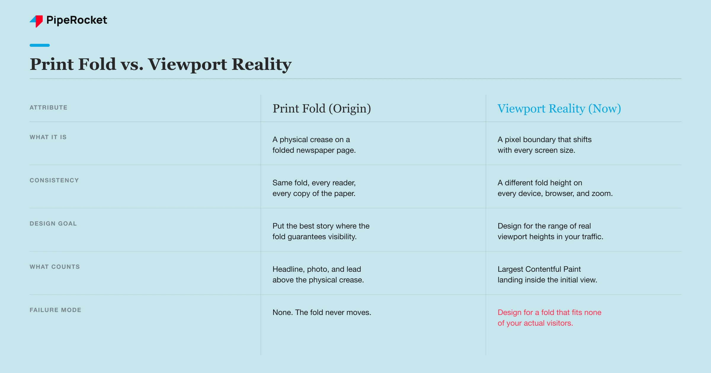
That’s the part worth pushing back on. Above the fold made perfect sense in print, where every copy of a newspaper folded at the same spot and every reader saw the identical boundary.
On the web, the “fold” is a different pixel height for a visitor on a 13-inch laptop, a visitor on a phone in portrait, and a visitor with the browser toolbar expanded. There is no single fold.
There’s a distribution of fold heights across your actual traffic, and most of them don’t match the 900px mockup someone approved in a design review.
- Print origin: The term describes the crease on a folded newspaper, where the top half had to work as a standalone sales pitch for the story below.
- Viewport, not fold: On the web the equivalent boundary is the browser viewport, and it shifts with screen size, orientation, and zoom.
- No fixed number: A “1,000px above the fold” rule might hold for one device and cut off your CTA entirely on another.
- Mobile dominance: Most SaaS and B2B sites now see the majority of first sessions on mobile, where viewport heights vary the most.
- Design against a range: The workable version of this concept is a range of common viewport heights, not one boundary.
Consider a project management tool for construction teams that redesigned its homepage hero around a 900px “above the fold” line measured on a designer’s 15-inch laptop. On a mid-range Android phone with the address bar visible, that same hero cut off the CTA button entirely.
What this means in practice: if you’re still asking “what goes above the fold” as a single question, you’re solving for one screen out of dozens your visitors actually use. The better question is what has to render fast and visible across your shortest common viewport.
Where Did the Term “Above the Fold” Come From?
It came from print newspaper layout, where editors put the strongest headline and photo on the top half of the front page, above the physical crease where the paper folded on the newsstand rack. Everything above that line had one job: sell the paper before anyone picked it up.
Web designers borrowed the phrase in the mid-1990s as browsers standardized around a roughly similar screen resolution. For a while it held up reasonably well, since most desktop monitors rendered a comparable viewport height and a fixed “fold” was a workable shorthand for what a visitor saw first.
- Newsstand logic: The fold existed to sell a physical product sitting in a rack, competing against other papers next to it.
- Early web parity: 1024x768 monitors were common enough that “above the fold” briefly meant something consistent.
- Borrowed shorthand: Designers reused a familiar term instead of inventing new vocabulary for viewport behavior.
- Assumption baked in: The metaphor assumes one boundary applies to every reader, which was true in print and stopped being true online.
The metaphor made sense for exactly as long as screens looked alike. Once phones, tablets, ultrawide monitors, and responsive layouts entered the picture, the assumption underneath the term quietly stopped being true, but the phrase kept getting used anyway.
Fast Fact: Organic search drives 91.3% of SaaS traffic, and that traffic arrives across dozens of different viewport heights, not one screen size.
Why Is Designing Around One Fixed Fold a Mistake on Responsive Sites?
Because your traffic doesn’t share one viewport height, and a layout tuned to a single assumed fold will misfire for a large share of visitors. Most teams pick a fold height from whatever device is on the design team’s desk, then ship it as a universal rule.
That’s backwards. A SaaS site’s visitors split across phones, tablets, laptops, and desktop monitors, and each category spans a range of heights on its own.
A layout that puts the CTA at 850px works for a MacBook Air. It fails for a phone turned sideways, or a laptop with a bookmarks bar showing.
- Traffic mix, not one device: Pull your analytics viewport-height report before assuming what “the fold” even is for your audience.
- Browser chrome eats space: Address bars, bookmark bars, and notification banners all shrink the visible area unpredictably.
- Zoom and accessibility settings: Visitors using browser zoom or larger system fonts see less content in the same nominal viewport.
- Orientation changes everything: A phone turned sideways has roughly half the vertical space of the same phone in portrait.
Here’s the real trade-off: cramming your headline, subhead, nav, hero image, and CTA into a tight assumed fold height gives you a clean design comp. It fails the moment a real visitor’s viewport is shorter than the one you designed for.
It’s worth doing if you’ve actually measured your traffic’s shortest common heights. It’s a guess if you haven’t.
Also read: best B2B SEO agencies
What Actually Matters Instead of “The Fold”?
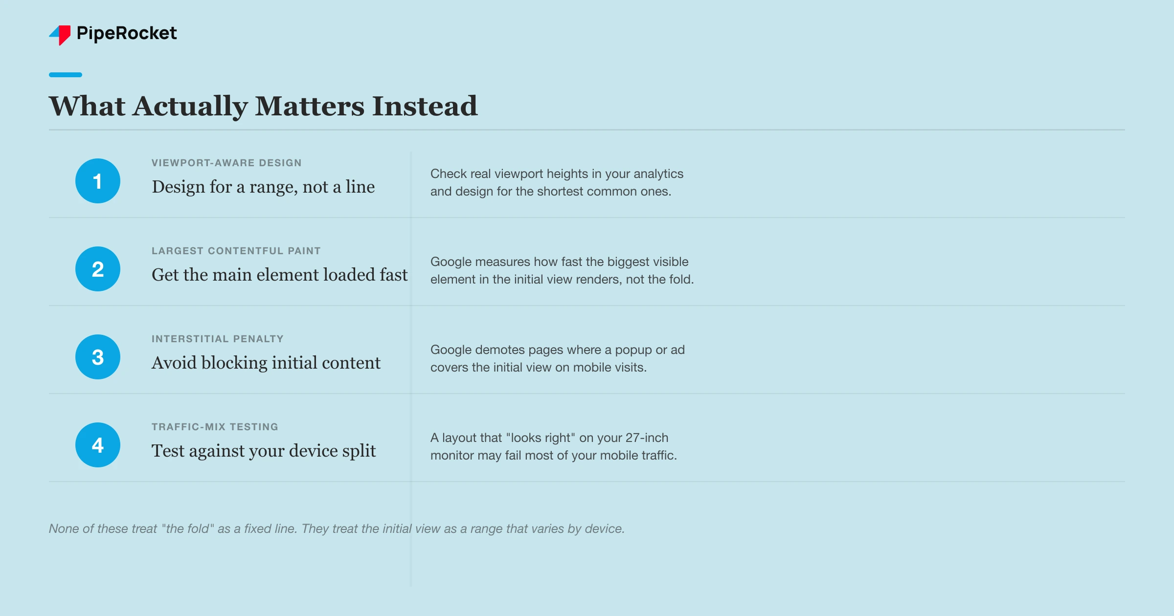
What matters now is whether your Largest Contentful Paint element renders fast inside a visitor’s actual initial view, not whether content sits above some assumed line. Google’s page experience signals are built around measured behavior, not a fixed pixel boundary.
Largest Contentful Paint is one of Google’s Core Web Vitals, and it measures how quickly the biggest visible element, usually a hero image or headline, finishes rendering in whatever viewport a visitor gets. A fast LCP matters regardless of whether that element sits at 400px or 900px down the page.
- LCP inside the initial view: Google wants the main visible element to render fast, not to sit above an arbitrary line you drew in Figma.
- Viewport-aware design: Build layouts that hold up across a range of real heights, not one target number.
- Intrusive interstitial penalty: Google demotes mobile pages where a popup, app-install banner, or ad blocks the content a visitor came for.
- Content, not decoration: A fast-loading, legible headline beats a slower, heavier hero image every time on mobile.
Take a compliance automation tool for fintech startups. Its old homepage buried the “Book a Demo” CTA under a full-width video that took two seconds to start playing, technically “above the fold” on desktop but invisible to any mobile visitor whose LCP element was still loading.
Swapping the video for a static image with the same CTA fixed both problems at once, because the visible element rendered immediately instead of waiting on a video player.
The intrusive interstitial penalty is worth understanding on its own, since it directly punishes the “put everything above the fold” instinct. If a popup, sign-up gate, or ad covers the main content right after a mobile visitor lands, Google can treat that as a worse page experience signal.
Fast Fact: Organic search converts SaaS visitors at 0.92%, more than 3x the rate of AI-driven traffic at 0.26%, and a slow or blocked initial view is one of the fastest ways to lose that advantage.
It’s the opposite lesson from the old print instinct. Stuffing more into the initial view isn’t automatically better, and sometimes it actively costs you ranking.
How Much Content Should You Put Above the Assumed Fold?
Less than you think, and the failure mode runs in the direction most teams don’t expect.
Teams that treat “the fold” as sacred real estate tend to cram a nav bar, an announcement banner, a hero headline, a subhead, an image, and a CTA into the first 600 to 800 pixels.
The initial view turns into visual noise on shorter viewports. This works when the initial view carries one clear message and one clear action.
It fails when marketing, product, and sales each want their priority stacked into the same cramped space. Every added element pushes the actual CTA further down and slows the page’s LCP at the same time.
- One primary message, not five: Pick the single thing a first-time visitor needs to understand, and let everything else load below.
- Announcement banners cost more than they earn: A promo bar pushes your real content down and often triggers the interstitial penalty on mobile.
- Test against your shortest common viewport: If your CTA disappears on a standard phone in your analytics, it’s not “below the fold,” it’s cut off.
- Heavier isn’t safer: Adding more elements to guarantee visibility usually slows the page enough to hurt the exact metric you’re protecting.
A generic marketing checklist for structuring a homepage hero can only take you so far, since it can’t see your actual device mix or your actual LCP element. Pairing that with real technical SEO auditing on your specific pages is where the fix actually happens.
Also read: best SaaS marketing agencies
Frequently Asked Questions
1. Does above-the-fold content still affect SEO rankings directly?
Not as a named ranking factor, but indirectly, yes. Google’s page experience signals, particularly Largest Contentful Paint and the intrusive interstitial penalty, both react to what happens in a visitor’s initial view. A slow-loading hero or a popup that blocks content can hurt rankings even though “above the fold” itself isn’t a metric Google measures.
2. How do I know what my visitors’ actual fold height is?
Pull the viewport-size report from your analytics tool and look at the 25th percentile height across your mobile traffic, not the average. That shorter number tells you what a meaningful chunk of visitors actually see without scrolling, which is far more useful than guessing from a single design comp.
3. Is it ever fine to design for one specific fold height?
Only if you’ve verified that one device category dominates your traffic and you’re building a single-purpose landing page for a specific ad campaign matched to that audience. For any general-purpose homepage or product page serving a mixed device audience, designing for one fold height will always underserve a real slice of your visitors.
The Bottom Line
Stop asking what should go above the fold and start asking what your shortest common viewport actually shows. Pull your device-height data before your next homepage redesign, not after.
If you want a technical audit of how your current layout performs across real viewports, get in touch , or see how our SaaS SEO service approaches page experience.